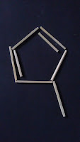
These are diagrams for chemicals that I have found on the internet. I quite like the idea of creating a typeface that is constructed out of this hexagon shape and single and double bond lines. I think that the hexigon already lends itself to the basis of a letterform. I am going to experiment with different ways of creating letterforms using these structures. I will initially experiment with matchsticks. Each matchstick is equal in length so it will be an accurate representation of the single and double lines found in these diagrams.
When designing this typeface, I am always going to make sure that I stick to the angles that the lines use in the chemistry diagrams. Therefore, if I am to do ascenders/decenders on letterforms, I would illustrate this with a single or double bond. This bond must come from the main pentagon shape with an angle that relates to the construction of the pentagon shape. I can remove areas of the origional pentagon shape but I cannot add horizontal or vertical lines. I am also using the occasional double lines which relate to double bonds.
Here I have spelled out the word hydrogen with the typeface that I am designing. I think it works quite well, so I am going to see what it looks like once I have made it a vector in illustrator.
After making this typeface digital, I think that it definitely needs work. The characters look odd. It looks like typeface that would suit a Chinese restaurant. I am going to rethink the typeface. This time, I am going to create it through the use of gridded paper before I make it digital. I want to experiment with pushing the boundaries of typographic form. I want small ascenders and descenders. I want the typeface to be much more structured. It would be great if I could create a typeface that works without gaps between letters similarly to the way that scientific illustrations are created.


