To be able to create symbols effectively for the stencils, I am going to look at some references of symbols that already exist.
I have found a great book in the library at university.
It is called the symbol sourcebook by Henry Dreyfuss. Inside it is absolutely packed with hundereds of symbols. The book is catagorised into sections, I even found a section on chemistry symbols.
The first thing that I notice about these symbols are their simplicity. I need to create symbols that use as few elements as possible. This is because firstly, they need to be inkeeping with the style of the symbols on the helix stencil. On the helix stencil, the symbols are incredibly simple and focus on the most recognisable components of the object it is illustrating. Secondly, a more complex symbol means that it will take longer to draw through the stencil and create the image. This means that the stencil is less practical. We actually want the stencils to be used. We do not want them to be used purely for decoration.

I really like the hangers symbol here. The plane uses as few components as possible in its creation. It is just one shape. Also, the corners are curved. For us to create a consistant set of symbols we need to carefully consider the corners of the design of all of the symbols. We need to establish a system to create them. This will include a minimum stroke width on lines. Factors that decide this will be the thickness of the drawing material that will be used with the stencil.
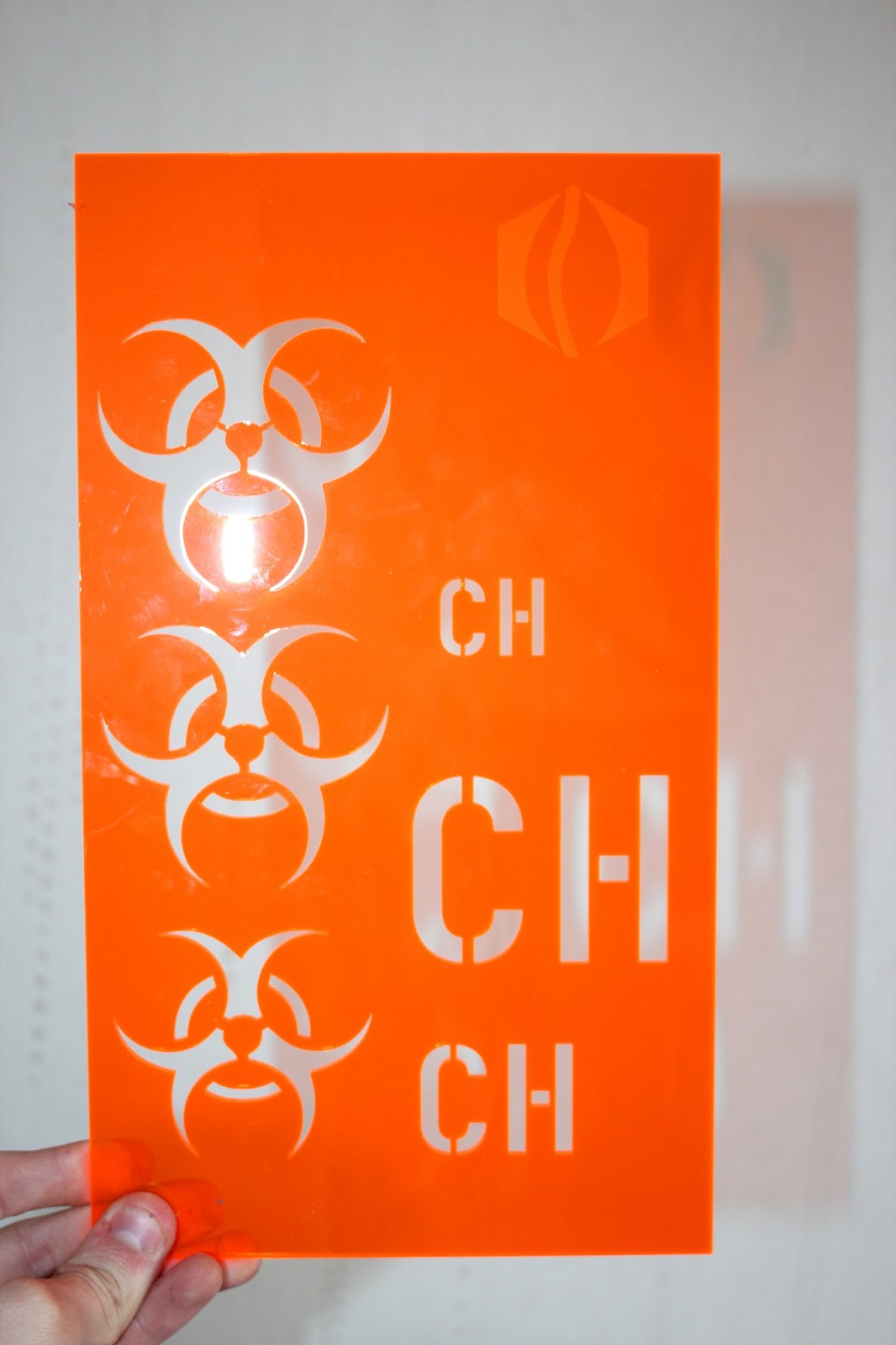
Above are the chemistry symbols in this book. I like the idea of creating a set of arrows and a plus and a minus symbol. They could be placed aesemetrically on the stencil and used whenever they were needed. Then, if they had symbols such as letters numbers they could illustrate chemical equations whilst they are talking. Of course, this idea depends on what they say when they get back to use with a final list of elements for what they want us to illustrate through symbols.

Some of the stymbols above are great. Its amazing how informative such a simple symbol can be. For instance, look at the kettle symbol (left page, 6 rows down, 5 symbols in). It is literally just a rectangular shape with a spout and a handle. Each of these elements are illustrated with the simplest of forms. The handle is just one semi-circular line with a stroke width. The spout is just a rounded trianglular shape which connects to the body of the kettle. My task is to simplify objects to their simplest, most recognisable forms.
Another thing that I will always have to keep in mind when designing my symbols is that they are going to be used as stencils. Therefore, they cannot have shapes within shapes as they will fall out when the plastic is lazer cut. This is not a problem however, I just need to figure out a way of either filling in areas of shape or creating cuts into lines (similarly to type stencils).
I have also been documenting symbols that I have found over the last week through photography. Symbols are everywhere and part of our daily life. They are used as a means of communicating in its simplest form.
This is a great symbol above that is communicating an escalator It has been simplified in such an extreme way but it is still immediately recognizable as an escalator People are communicated by a circle for the head and a rounded topped rectangle for the body. The escalator is very short, but the angle that it makes with the horizontal and the illustration of people standing on it are enough for the symbol to fulfill its purpose- to look like an escalator I particularly like the large stroke that has been placed on the escalator outline. I think that it makes it bold and a stroke like this would easily be able to be used as a stencil with a piece of chalk or a pen.

Again, a train on a track here is shown with extreme simplicity. The track is illustrated by two lines that show perspective. it is interesting that they are separated from the body of the train, but it is still obveous that the train is on the track. I think that the windows and the lights are an effective way of communicating the fact that this is the front of a train, but I would not be able to create a symbol like this because these elements would fall out of a stencil and I would just be left with the outline of the front of a train.
Above is a great symbol. It is symbolising an exit. This has been illustrated with an arrow and a line with two corners. Even though this line does not look like a door, the symbol suggests an exit. Perhaps it is because the left missing side of the rectangle shape suggests that the door is open? Or perhaps it is just a symbol which we have become so familiar with that we now immediately associate it with its purpose.

The above I found on a train station and it shows the type of message that can be achieved when 2 or more symbols are used together to create one image. It is clear that this 3 symbols illustrating a waiting room. The clock suggests time, the suitcase suggests that it is a place that you can rest luggage, and the person sitting down suggests the chairs that are in the room for waiting. I suppose that the person sitting with an arrow pointing in the direction of the waiting room could have also illustrated this point, but using the 3 symbols is a more fun way of communicating the message. We could achieve a similar thing with our science stencil designs. We could create 2 or 3 symbols that work together to illustrate one point or idea.
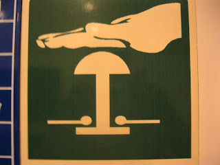
Although the hand above is quite intricate in design for a symbol, This would actually work as a stencil. This is because it is created with one continuous line as an outline. I think however that this does not really work visually as a symbol. The thing that he is pressing is such a simple, styalised symbol that reduces the object to its simpliest form (I am not sure why they have illustrated the wires coming from this). The hand is more complex and shows details such as finger nails and the thumb line. I think that they could have communicated this hand by a simple filled in outline.
Above is another example of two symbols working together to create a message- press the button in the event of a fire. This message is communicated with great simplicity. Visually however, I do not think that the flames are aesthetically designed.
The left of the two messages shows how three symbols work together to communicate a message. The man running, the arrow pointing downards and the extremely simplified door conveyed as just a rectangle show that in an emergency, you should leave as quickly as you can through the door that is located below this sign. It is a brilliantly effective illustration and shows how important arrows can be as communicative devises in symbols.