Tuesday, 12 March 2013

The symbols designing

Finally, we have had the list of symbols for each of the four areas from Bath Uni and so now we can get on with designing them.


We thought that the best way to approach designing these symbols is to each take the large task of designing a symbol for each of the ideas. We would try and make the symbols as consistant as possible in style. Outlined specifications were that we would make the symbols as simple as possible. Naturally, they would also have to be designed to be able to be used as stencils. We decided that then, we would print all of the symbols out and compare them, deciding upon a final set of symbols which would inevitably include a mixture of everybody's symbols attempt. 


These are my initial stencil ideas. They have taken rather a long time to produce. It has been a crash course in illustrator and I have had to research tutorials to get the best out of the programme. The symbols have to be created as outlines and so I have had to learn how to do this, this means fully understanding the pathfinder tool and how illustrator renders shapes and objects. Some of these symbols are stronger than others, but that was inevitable. 

Each of us produced a set like this and they were laid out across a table. We then went through the list of symbols that we needed and circled the strongest attempt from the four of us. We now have a complete set of symbols ready to show Bath Uni on Monday. 


Thursday, 7 March 2013

symbols research

To be able to create symbols effectively for the stencils, I am going to look at some references of symbols that already exist.
I have found a great book in the library at university.

It is called the symbol sourcebook by Henry Dreyfuss. Inside it is absolutely packed with hundereds of symbols. The book is catagorised into sections, I even found a section on chemistry symbols. 


The first thing that I notice about these symbols are their simplicity. I need to create symbols that use as few elements as possible. This is because firstly, they need to be inkeeping with the style of the symbols on the helix stencil. On the helix stencil, the symbols are incredibly simple and focus on the most recognisable components of the object it is illustrating. Secondly, a more complex symbol means that it will take longer to draw through the stencil and create the image. This means that the stencil is less practical. We actually want the stencils to be used. We do not want them to be used purely for decoration. 


I really like the hangers symbol here. The plane uses as few components as possible in its creation. It is just one shape. Also, the corners are curved. For us to create a consistant set of symbols we need to carefully consider the corners of the design of all of the symbols. We need to establish a system to create them. This will include a minimum stroke width on lines. Factors that decide this will be the thickness of the drawing material that will be used with the stencil.


Above are the chemistry symbols in this book. I like the idea of creating a set of arrows and a plus and a minus symbol. They could be placed aesemetrically on the stencil and used whenever they were needed. Then, if they had symbols such as letters numbers they could illustrate chemical equations whilst they are talking. Of course, this idea depends on what they say when they get back to use with a final list of elements for what they want us to illustrate through symbols. 


Some of the stymbols above are great. Its amazing how informative such a simple symbol can be. For instance, look at the kettle symbol (left page, 6 rows down, 5 symbols in). It is literally just a rectangular shape with a spout and a handle. Each of these elements are illustrated with the simplest of forms. The handle is just one semi-circular line with a stroke width. The spout is just a rounded trianglular shape which connects to the body of the kettle. My task is to simplify objects to their simplest, most recognisable forms. 
Another thing that I will always have to keep in mind when designing my symbols is that they are going to be used as stencils. Therefore, they cannot have shapes within shapes as they will fall out when the plastic is lazer cut. This is not a problem however, I just need to figure out a way of either filling in areas of shape or creating cuts into lines (similarly to type stencils).

I have also been documenting symbols that I have found over the last week through photography. Symbols are everywhere and part of our daily life. They are used as a means of communicating in its simplest form. 


This is a great symbol above that is communicating an escalator  It has been simplified in such an extreme way but it is still immediately recognizable as an escalator  People are communicated by a circle for the head and a rounded topped rectangle for the body. The escalator is very short, but the angle that it makes with the horizontal and the illustration of people standing on it are enough for the symbol to fulfill its purpose- to look like an escalator  I particularly like the large stroke that has been placed on the escalator outline. I think that it makes it bold and a stroke like this would easily be able to be used as a stencil with a piece of chalk or a pen. 


Again, a train on a track here is shown with extreme simplicity. The track is illustrated by two lines that show perspective. it is interesting that they are separated from the body of the train, but it is still obveous that the train is on the track. I think that the windows and the lights are an effective way of communicating the fact that this is the front of a train, but I would not be able to create a symbol like this because these elements would fall out of a stencil and I would just be left with the outline of the front of a train.


Above is a great symbol. It is symbolising an exit. This has been illustrated with an arrow and a line with two corners. Even though this line does not look like a door, the symbol suggests an exit. Perhaps it is because the left missing side of the rectangle shape suggests that the door is open? Or perhaps it is just a symbol which we have become so familiar with that we now immediately associate it with its purpose. 


The above I found on a train station and it shows the type of message that can be achieved when 2 or more symbols are used together to create one image. It is clear that this 3 symbols illustrating a waiting room. The clock suggests time, the suitcase suggests that it is a place that you can rest luggage, and the person sitting down suggests the chairs that are in the room for waiting. I suppose that the person sitting with an arrow pointing in the direction of the waiting room could have also illustrated this point, but using the 3 symbols is a more fun way of communicating the message. We could achieve a similar thing with our science stencil designs. We could create 2 or 3 symbols that work together to illustrate one point or idea. 
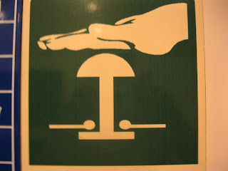

Although the hand above is quite intricate in design for a symbol, This would actually work as a stencil. This is because it is created with one continuous line as an outline. I think however that this does not really work visually as a symbol. The thing that he is pressing is such a simple, styalised symbol that reduces the object to its simpliest form (I am not sure why they have illustrated the wires coming from this). The hand is more complex and shows details such as finger nails and the thumb line. I think that they could have communicated this hand by a simple filled in outline. 


Above is another example of two symbols working together to create a message- press the button in the event of a fire. This message is communicated with great simplicity. Visually however, I do not think that the flames are aesthetically designed. 


The left of the two messages shows how three symbols work together to communicate a message. The man running, the arrow pointing downards and the extremely simplified door conveyed as just a rectangle show that in an emergency, you should leave as quickly as you can through the door that is located below this sign. It is a brilliantly effective illustration and shows how important arrows can be as communicative devises in symbols. 


Tuesday, 26 February 2013

initial idea

Myself and Andy Ashwin have decided that for the next meeting, we are going to produce mock ups of leaflet or hand out ideas to show them to get the ball rolling for format of design. We havent actually had the final list of elements from Bath university yet so we havent created any final symbols, but to convey my message I have been designing my own set of symbols. They are by no means refined yet, but I feel that they communicate the message effectively.
I have been thinking about the initial presentation that we had and have come up with a list of the most rememberable facts of the day. I need to clarify the facts with the Bath Uni client. I have tried to write them in as few words as possible in the aim to make short, punchy, powerful facts that people remember and want to find out more after reading. They are:
  • Helium should cost two hundred pounds per balloon
  • Smartphones contain, on average, fourty extremely rare elements
  • Without chemicals there would be nothing. Literally. 
  • In 20 years there will be no oil 
  • Enough light falls on the Earth in one hour to provide energy for an entire year
  • Cars produce ten kilograms of carbon dioxide per gallon of fuel
  • The energy used to make one thousand plastic cups is required to make one ceramic mug
There are seven facts here. For the final handout idea, I think it would be good to have ten facts. But for now, I am going to experiment with format for these facts and also come up with some initial symbol designs to illustrate them. 

The above symbol shows stacks of cups. However, I have realised that this symbol will not work when it comes to being a stencil. The middle triangle shapes showing individual coffee cups will fall of of the stencil when it is cut. 

This symbol needs to be refined if it is to be used as one of the final symbols, but to illustrate my concept for a small handout in our meeting it is ok. 


Balloons are particularly difficult to create in illustrator, it is really hard to get a smooth curve. I have created this by making it in two halves. Once the left half was made, I duplicated it and reflected it vertically. Then, a symetrical balloon shape is created. 


I really dont like this world symbol that I have created. It is definitely a symbol that needs refining. I need to come up with another way of illustrating the message that everything is made up of chemicals. For now though, it is fine for illustrating my concept. 


I am really pleased with the outcome of this car. I think it looks great. However, it may need simplification when we come to design final symbol ideas as it does use quite a few elements. 


I really like the design of this book, and so did Bath uni. They loved the idea of having actual stencils in the handout. I used very simple layout to convey the messages. Where possible, I tried to have only one word per line. Also, I numbered all of the points with hashes. After every symbol page is a blank white page so that the symbol is white when the book is opened and viewed. beneath the symbol on this lower page I will place a small amount of further information about the fact. 
Though, I do have a problem with this booklet. I imagine that the cost to print it is going to be extremely high. It depends how large their print budget is. I will get it costed. I also shown them an idea where the symbols were not cut out. It is not as dynamic but still gets the message across in a bold, powerful way. 


Friday, 15 February 2013

Concept visualised

Now that we have the concept firmly established, we have set about designing a document which shows the concept to Bath university. They may reject the idea, but we feel that we must put a lot of effort into visualizing the idea to give it the best possible chance.
Myself, Andy Ashwin and Nathan set about this task. Andy had ordered a helix science stencil online which had arrived, so we set aside a few days to work on the visualisation of our idea.
First, we all came up with potential logos for the branding of this concept. Andy Ashwin had come up with the idea of playing on the rather overstated description of the IT technitions at Apple. Their genius bar is well established and iconic, but they are not really genius's. The chemistry guys at Bath Uni really are. So Andy suggested that we play on this idea, branding the bath uni guys actual genius's and playing on the existing genius logo.
I liked this idea and set about developing some logo ideas based around the word "genius" and "actual genius".
Their current logo is an awful green and black colour.


I thought that the best place to start with an idea for a logo is with this. They have mentioned something about not being able to change the logo despite its awful appearance, but I am going to try it anyway and see if the idea is a possibility in our meeting with them. 


It is quite amazing how much of a difference this new colour scheme has made to the logo. It is so much more punchy and powerful as a logo. It looks more refined and sophisticated. I am going to develop this idea and see if I can come up with a logo that is completely unique for branding this idea. 


I actually really like the above idea that I have created. It plays on the hexagon shape that is used in chemistry diagrams. It is made playful by the way that genius runs in a ring around the word bar. It uses the din typeface. Din is such a nice sans serif font. It has a science, clinical feel about it. It comes in various weights including light and medium which are used here. The only problem with this typeface is that I read sbarn it is viewed from left to right. 


I quite liked the above logo. I am playing around with perspective and chemical structures. I heavily kerned the word genius to give it a lighter, more sophisticated feel. This balances the unsophisticated nature of the image of chemical bonds. However, then I got told that it looks like a cat. This has ruined it for me as now that is all that I can see!


I quite like the orange logo of these two. the fine line on the light typeface and the light stroke around the hexagon shapes which underline the word genius give it a sophisticated feel. The heavy kerning also helps with this. I was experimenting with typeface on the black attempt at logo. I thought that perhaps a more rounded typeface may be more effective than the din typeface because it is more friendly in appearance. However, we are trying to advertise genius's and playing on the apple genius logo, I think it needs the sophisticated feel. 


Now that the three of us had some logos designed, we set about creating a pdf presentation of our concept. 


Andy came up with a nifty 3 dimentional model that was created in 3d modelling software. He created an idea where the black board behind the figures would be used to draw on with chalk, through the large stencils as the science guys give their talks and demonstrations. 


We have decided upon the typeface of Din. This typeface has a stencil version which is great for when we come to put text onto our large stencils. 


Me and nathan photographed the helix stencil that we had and then we set about doing some nifty and convincing photoshop work where we enlarged the stencil to visualise the size of the finished object. I am quite happy with the result of this. It took us a lot of attempts to photograph the stencil so that the lighting across it was even, but also so that it had a transparency it. In the end, we used remote flash and flashed the stencil both front and back during the shot. 


Nathan then put all of the content that we had created into the pdf ipad app and we were all set to go and present our concept! Thankfully, they were very impressed with the concept and we have finally got them excited about the project and about our ideas. The meeting was in a pub. This was a good idea, it was a relaxed atmosphere and ideas flow when you are in this type of environment. We now need a definitive list of things that they are going to talk about in their presentations and talks so that we can create symbols to illustrate what they are saying. We also decided that we will have a weekly meeting every Monday from this moment onwards. This seems like a good idea. We can regularly reflect on progress made and the project should move on quickly. 


Monday, 11 February 2013

New approach to the brief

Unfortunetly, I could not be in Bath for the visit to Bath uni to see where the people from the sustainable chemical technologies center work. It was a very last minute arrangement that I could not attend. However, I arranged for Jordan to take notes for me. We had decided that we were going to collaborate on this project. When I arrived back in Bath today, I was updated with what had happened in their meeting at Bath University. Andy Ashwin had documented the visit and so I got to see photographs of what the labs look like.


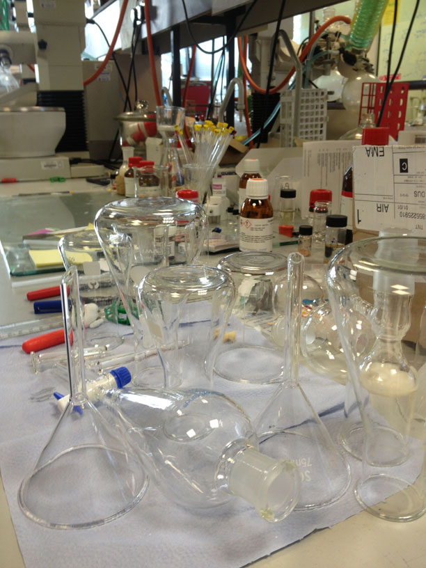
They are exactly as I imagined them to be. They are littered with test tubes, clonical flasks and large scientific experiments .On the walls are chemical structure diagrams and chemical equations. 
I was also told about their meeting after the tour of the labs in the bar of the uni. It has been decided that the project will now be a group project as there are only four of us that are wanting to be involved in it. This is quite surprising considering that there was over 15 of us at the initial presentation. I presume it is because of the lengthy wait that we have had between the initial meeting and this catch up. 
During this informal chat they have brainstormed ideas. A break through idea has come about which is a solution to all of the 4 science briefs.When thinking about associations with science and chemestry, something that immediately springs to mind is the orange helix stencils. Everybody has seen one. They are used at schools for designing experiments.


 The symbols are extremely simple but illustrate the chemistry equipment with great effectiveness. Imagine at the science fares if these stencils were created on a massive scale, using symbols which illustrate the 4 talks! This idea is the breakthrough that we have been searching for and the idea that we are going to take forwards. The strong orange and the white shapes could be the colour scheme. If everybody from bath uni at the science fare was wearing this colour and the entire stand utalised this intense orange then they would stand out from the rest of the stalls. Now that we have commited ourselves to an idea that we are going to take forwards, we need to prepare a document which illustrates the idea to the Bath uni guys in the meeting that we have arranged on Monday.